Hi, today I'd like to talk about user autonomy in the context of UX design, and how I used this concept to improve the market analysis page for Eve Subsystem Analysis in Version 2.1. I define user autonomy as the ability of users to make changes to the information that's displayed in the browser based on what they think is relevant. As a UX designer, I think that ideas like this often get pushed aside in favour of more domain-specific discussions about frameworks, syntax, etc. It's not that I don't think that those are good conversations to be having, but I'd like to expand on that a little bit here by focussing solely on how humans and computers actually interact.

User Autonomy
UXUIReactDesignEve-OnlineData-Visualisation
Issues With Version 2.0
So, from the get-go, I had this idea in mind for the market analysis page on Eve Subsystem Analysis. I wanted to have this cool single page, where the user could go to and they'd be hit with a dashboard containing all of the market information that they would need in order to help them decide whether now would be a good time to buy, sell or manufacture a specific subsystem. If you don't know what subsystems are, just think of them as like an asset-class, actually a lot of the design for this website was based on trading/ market analysis platforms that are out there. But I wanted this page in particular to be like a Bloomberg Terminal for subsystems. With that in mind, here's the initial design I came up with:
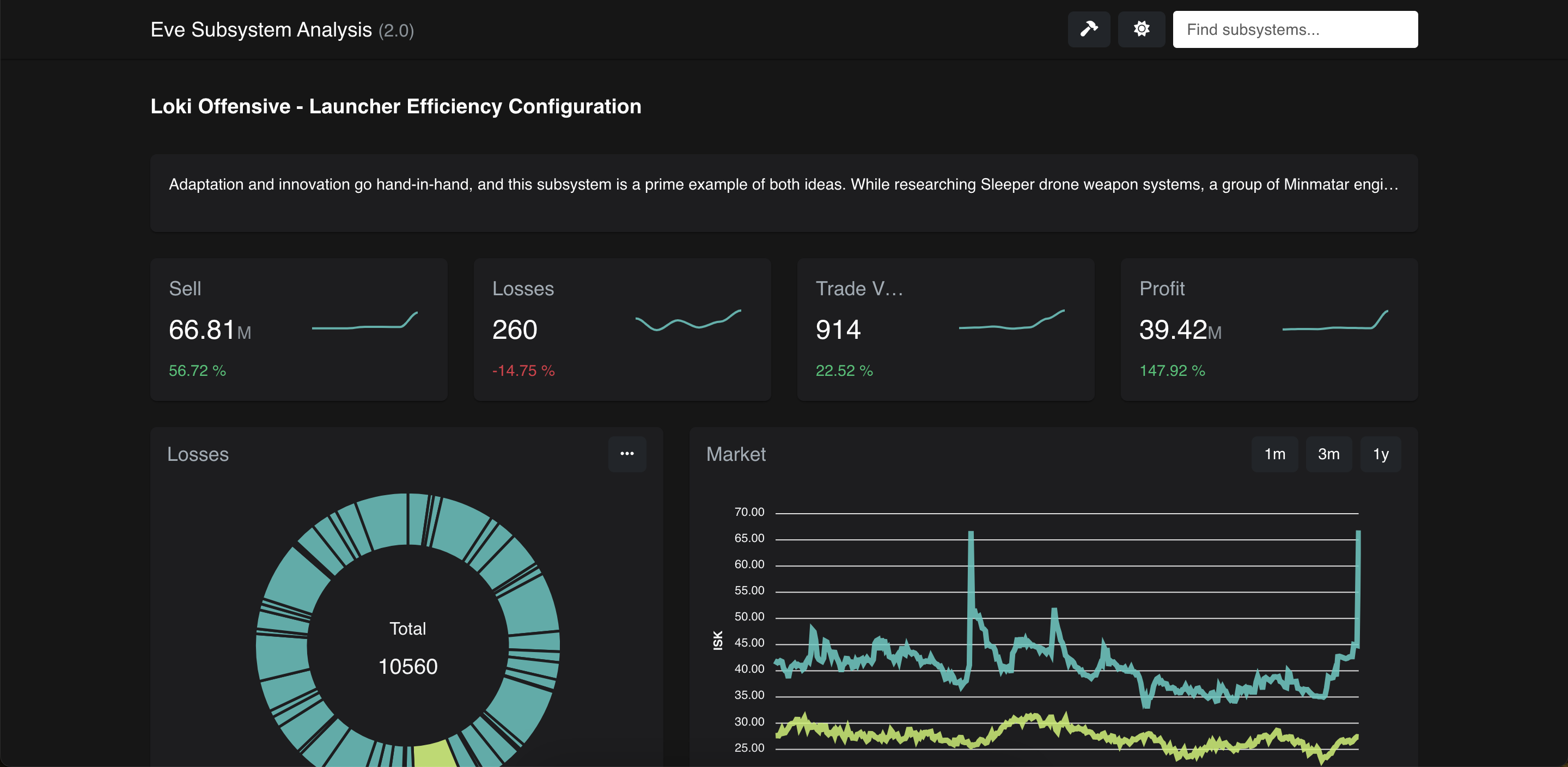
The above screenshot can be seen as a litmus test for whether someone plays Eve Online. For those who haven't played it, the typical response is "What am I looking at here?" However when I shared it with my Eve friends I would hear "That is so cool". It's a gap that's hard to bridge, so if you find yourself in the former camp, it's probably easier to imagine this as a stock trading dashboard with some useful stats that might help you know whether to invest in a stock.
Just a Pretty Face
For a while, I was pretty happy with the dashboard I had created here. It looks visually impressive, and it conveys a lot of pretty useful information. The design is also slick, with spark-line graphs across the top and a cool teal theme for the pie chart and graph lines. I shipped version 2 and went about actually using the platform I had created for its intended purpose. Then after a while I realised something, I wasn't using this feature of the app at all.
This page, which I had worked so hard on was in fact, totally useless at its intended design purpose of helping me make decisions regarding which subsystems to manufacture. This was obviously a problem since, the work that went into creating it had taken up a lot of development time. Yeah it looked cool, but if a tree looks cool in the woods and no one's there to see it then does it really look cool at all? Something had to be done.
Diagnosis
Getting to the heart of the issue, there were two problems with this page. The first is that there was another table on the site which linked to this page, that already contained a lot of the data that this page would have told me. In fact, the home page contained data about the current sell price, recent losses (demand) and market volumes, that this page simply displayed in graph form. This highlights an issue that's a bit beyond our scope here of having too much overlap in the utility of separate features, a topic that we may revisit another time. The more pressing issue with regards to user autonomy is that this web page didn't provide the user with the freedom to decide what the charts actually displayed, their position, or what they regarded as significant. In effect I'd embedded assumptions in the layout of the page about what the user ought to find significant, and that was really the heart of the problem.
A Change of Tack
Now that I'd had some time to reflect on what I didn't like about my previous approach, it allowed me to start again with the problems I had identified in mind. I opted for a revision to the market analysis page with much more interactivity, and an emphasis on letting the user make choices about what mattered. This approach culminated in a UI with two separate components, a chart component which would display charts that the user thought were relevant to their analysis of the current market price of the subsystem they're inspecting, and a data-table containing the values of all of the data stored in the database that could impact the price.
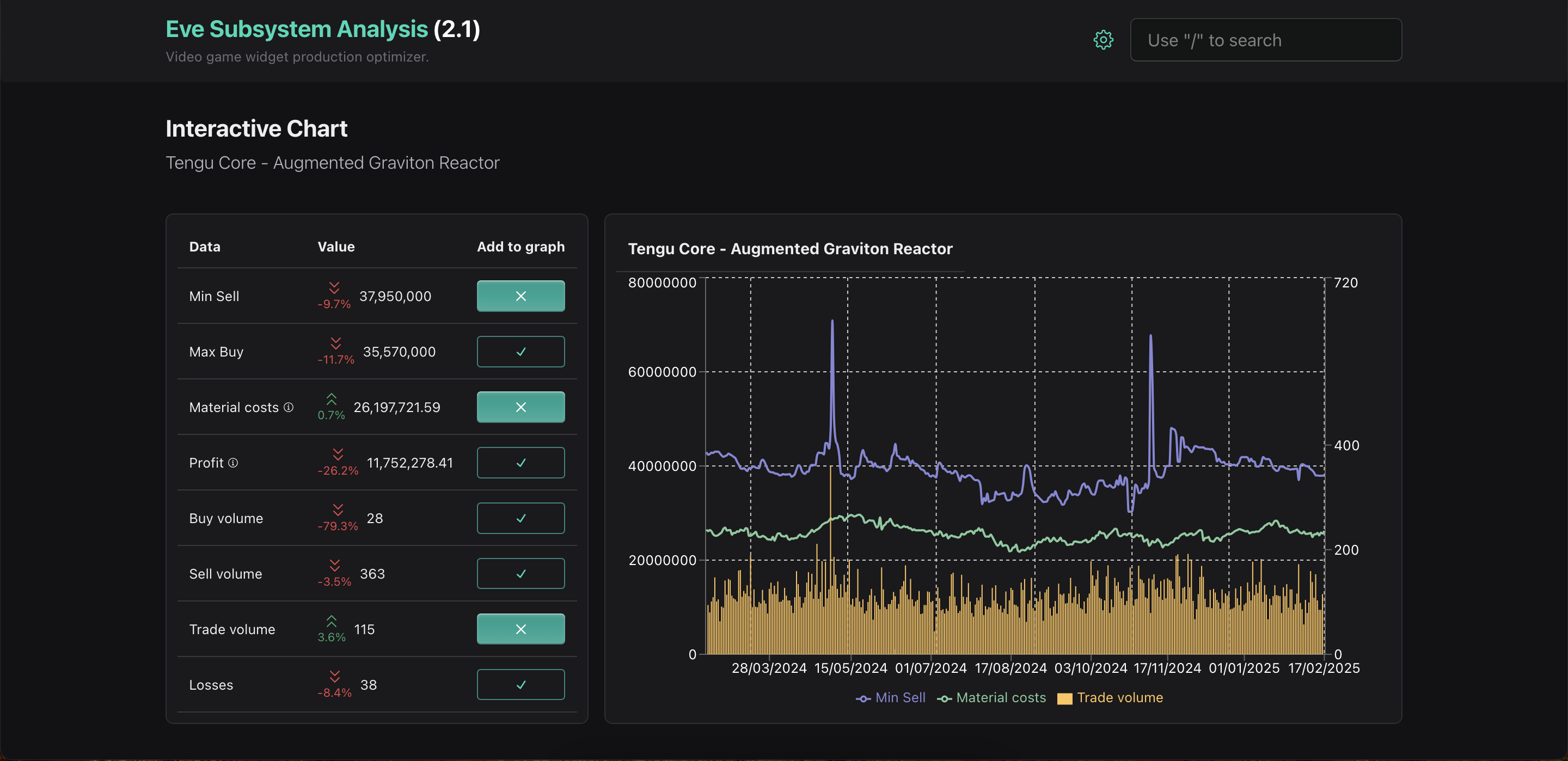
Let's go over the design above in a bit more detail to explain why it's more useful and why the emphasis on user autonomy matters here. So the data in the table on the left displays the current market conditions of the item that's being analysed (In this case we're looking at Tengu Core - Augmented Graviton Reactor subsystems). The minimum sell price is listed at the top, and the teal button next to it shows that this data has been selected to be displayed in the chart on the right. Clear buttons are not displayed in the chart, but you can still see their current values for reference. The chart on the right contains all of the data for the selected variable over the past year (or however much is stored in the database). This new approach values the user's ability to make inferences about what variables could be significant to explaining the current price of an item. Is the current sell price below average? Perhaps it's an issue with over-saturation. Is the price a lot higher than usual? Let's check for a spike in demand! And so on... For the layout, I took some inspiration from another data visualisation tool that I was familiar with, Google Analytics (their exploration section, especially) although of course with far less feature density than their tool provides.
Summing Up
Summing up here, I think that this example highlights a couple interesting points when it comes to designing user-friendly online experiences. It demonstrates the kind of approach that's needed when making design iterations. That's thinking about what's fundamentally wrong with the thing that you're going to be iterating on, and how that might shape the changes that you're going to make. It also shows a bit about when and where it's best for the designer to relinquish control and empower the user to search for answers on their own.